The graphic design work of Alastair Keady and Fiona Burns
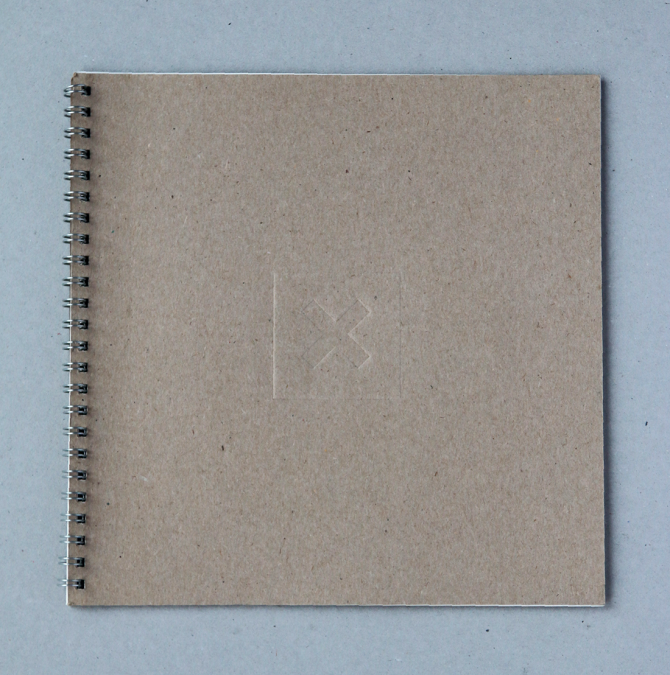

In contrast to most of the multimedia developer’s glossy promotional material at the time, we devised a utilitarian visual language for the branding of X Communications. Exhibition stands made from scaffolding, old school neon signage, and kraft board wiro bound brochures. The X Comms logotype ‘X’ was a suitable die-cut holder for discs. Blind embossed logo on the cover is the only subtle clue as to content.